第二十一章 更多指标数据
原文:More indicator data with Matplotlib
译者:飞龙
在这篇 Matplotlib 教程中,我们介绍了添加一些简单的函数来计算数据,以便我们填充我们的轴域。 一个是简单的移动均值,另一个是简单的价格 HML 计算。
这些新函数是:
def moving_average(values, window):
    weights = np.repeat(1.0, window)/window
    smas = np.convolve(values, weights, 'valid')
    return smas

def high_minus_low(highs, lows):
    return highs-lows
你不需要太过专注于理解移动均值的工作原理,我们只是对样本数据来计算它,以便可以学习更多自定义 Matplotlib 的东西。
我们还想在脚本顶部为移动均值定义一些值:
MA1 = 10
MA2 = 30
下面,在我们的graph_data函数中:
ma1 = moving_average(closep,MA1)
ma2 = moving_average(closep,MA2)
start = len(date[MA2-1:])

h_l = list(map(high_minus_low, highp, lowp))
在这里,我们计算两个移动均值和 HML。
我们还定义了一个『起始』点。 我们这样做是因为我们希望我们的数据排成一行。 例如,20 天的移动均值需要 20 个数据点。 这意味着我们不能在第 5 天真正计算 20 天的移动均值。 因此,当我们计算移动均值时,我们会失去一些数据。 为了处理这种数据的减法,我们使用起始变量来计算应该有多少数据。 这里,我们可以安全地使用[-start:]绘制移动均值,并且如果我们希望的话,对所有绘图进行上述步骤来排列数据。
接下来,我们可以在ax1上绘制 HML,通过这样:
ax1.plot_date(date,h_l,'-')
最后我们可以通过这样向ax3添加移动均值:
ax3.plot(date[-start:], ma1[-start:])
ax3.plot(date[-start:], ma2[-start:])
我们的完整代码,包括增加我们所用的时间范围:
import matplotlib.pyplot as plt
import matplotlib.dates as mdates
import matplotlib.ticker as mticker
from matplotlib.finance import candlestick_ohlc
from matplotlib import style

import numpy as np
import urllib
import datetime as dt

style.use('fivethirtyeight')
print(plt.style.available)

print(plt.__file__)

MA1 = 10
MA2 = 30

def moving_average(values, window):
    weights = np.repeat(1.0, window)/window
    smas = np.convolve(values, weights, 'valid')
    return smas

def high_minus_low(highs, lows):
    return highs-lows


def bytespdate2num(fmt, encoding='utf-8'):
    strconverter = mdates.strpdate2num(fmt)
    def bytesconverter(b):
        s = b.decode(encoding)
        return strconverter(s)
    return bytesconverter


def graph_data(stock):

    fig = plt.figure()
    ax1 = plt.subplot2grid((6,1), (0,0), rowspan=1, colspan=1)
    plt.title(stock)
    ax2 = plt.subplot2grid((6,1), (1,0), rowspan=4, colspan=1)
    plt.xlabel('Date')
    plt.ylabel('Price')
    ax3 = plt.subplot2grid((6,1), (5,0), rowspan=1, colspan=1)


    stock_price_url = 'http://chartapi.finance.yahoo.com/instrument/1.0/'+stock+'/chartdata;type=quote;range=1y/csv'
    source_code = urllib.request.urlopen(stock_price_url).read().decode()
    stock_data = []
    split_source = source_code.split('\n')
    for line in split_source:
        split_line = line.split(',')
        if len(split_line) == 6:
            if 'values' not in line and 'labels' not in line:
                stock_data.append(line)


    date, closep, highp, lowp, openp, volume = np.loadtxt(stock_data,
                                                          delimiter=',',
                                                          unpack=True,
                                                          converters={0: bytespdate2num('%Y%m%d')})

    x = 0
    y = len(date)
    ohlc = []

    while x < y:
        append_me = date[x], openp[x], highp[x], lowp[x], closep[x], volume[x]
        ohlc.append(append_me)
        x+=1

    ma1 = moving_average(closep,MA1)
    ma2 = moving_average(closep,MA2)
    start = len(date[MA2-1:])

    h_l = list(map(high_minus_low, highp, lowp))

    ax1.plot_date(date,h_l,'-')


    candlestick_ohlc(ax2, ohlc, width=0.4, colorup='#77d879', colordown='#db3f3f')

    for label in ax2.xaxis.get_ticklabels():
        label.set_rotation(45)

    ax2.xaxis.set_major_formatter(mdates.DateFormatter('%Y-%m-%d'))
    ax2.xaxis.set_major_locator(mticker.MaxNLocator(10))
    ax2.grid(True)

    bbox_props = dict(boxstyle='round',fc='w', ec='k',lw=1)

    ax2.annotate(str(closep[-1]), (date[-1], closep[-1]),
                 xytext = (date[-1]+4, closep[-1]), bbox=bbox_props)


##    # Annotation example with arrow
##    ax2.annotate('Bad News!',(date[11],highp[11]),
##                 xytext=(0.8, 0.9), textcoords='axes fraction',
##                 arrowprops = dict(facecolor='grey',color='grey'))
##
##
##    # Font dict example
##    font_dict = {'family':'serif',
##                 'color':'darkred',
##                 'size':15}
##    # Hard coded text
##    ax2.text(date[10], closep[1],'Text Example', fontdict=font_dict)


    ax3.plot(date[-start:], ma1[-start:])
    ax3.plot(date[-start:], ma2[-start:])


    plt.subplots_adjust(left=0.11, bottom=0.24, right=0.90, top=0.90, wspace=0.2, hspace=0)
    plt.show()


graph_data('EBAY')
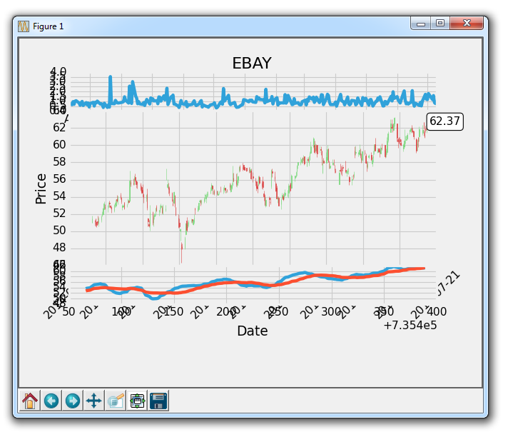
代码效果如图: