第二十四章 多个 Y 轴
原文:Multi Y Axis with twinx Matplotlib
译者:飞龙
在这篇 Matplotlib 教程中,我们将介绍如何在同一子图上使用多个 Y 轴。 在我们的例子中,我们有兴趣在同一个图表及同一个子图上绘制股票价格和交易量。
为此,首先我们需要定义一个新的轴域,但是这个轴域是ax2仅带有x轴的『双生子』。
这足以创建轴域了。我们叫它ax2v,因为这个轴域是ax2加交易量。
现在,我们在轴域上定义绘图,我们将添加:
ax2v.fill_between(date[-start:],0, volume[-start:], facecolor='#0079a3', alpha=0.4)
我们在 0 和当前交易量之间填充,给予它蓝色的前景色,然后给予它一个透明度。 我们想要应用幽冥毒,以防交易量最终覆盖其它东西,所以我们仍然可以看到这两个元素。
所以,到现在为止,我们的代码为:
import matplotlib.pyplot as plt
import matplotlib.dates as mdates
import matplotlib.ticker as mticker
from matplotlib.finance import candlestick_ohlc
from matplotlib import style

import numpy as np
import urllib
import datetime as dt

style.use('fivethirtyeight')
print(plt.style.available)

print(plt.__file__)

MA1 = 10
MA2 = 30

def moving_average(values, window):
    weights = np.repeat(1.0, window)/window
    smas = np.convolve(values, weights, 'valid')
    return smas

def high_minus_low(highs, lows):
    return highs-lows


def bytespdate2num(fmt, encoding='utf-8'):
    strconverter = mdates.strpdate2num(fmt)
    def bytesconverter(b):
        s = b.decode(encoding)
        return strconverter(s)
    return bytesconverter


def graph_data(stock):

    fig = plt.figure()
    ax1 = plt.subplot2grid((6,1), (0,0), rowspan=1, colspan=1)
    plt.title(stock)
    plt.ylabel('H-L')
    ax2 = plt.subplot2grid((6,1), (1,0), rowspan=4, colspan=1, sharex=ax1)
    plt.ylabel('Price')
    ax2v = ax2.twinx()

    ax3 = plt.subplot2grid((6,1), (5,0), rowspan=1, colspan=1, sharex=ax1)
    plt.ylabel('MAvgs')


    stock_price_url = 'http://chartapi.finance.yahoo.com/instrument/1.0/'+stock+'/chartdata;type=quote;range=1y/csv'
    source_code = urllib.request.urlopen(stock_price_url).read().decode()
    stock_data = []
    split_source = source_code.split('\n')
    for line in split_source:
        split_line = line.split(',')
        if len(split_line) == 6:
            if 'values' not in line and 'labels' not in line:
                stock_data.append(line)


    date, closep, highp, lowp, openp, volume = np.loadtxt(stock_data,
                                                          delimiter=',',
                                                          unpack=True,
                                                          converters={0: bytespdate2num('%Y%m%d')})

    x = 0
    y = len(date)
    ohlc = []

    while x < y:
        append_me = date[x], openp[x], highp[x], lowp[x], closep[x], volume[x]
        ohlc.append(append_me)
        x+=1

    ma1 = moving_average(closep,MA1)
    ma2 = moving_average(closep,MA2)
    start = len(date[MA2-1:])

    h_l = list(map(high_minus_low, highp, lowp))


    ax1.plot_date(date[-start:],h_l[-start:],'-')
    ax1.yaxis.set_major_locator(mticker.MaxNLocator(nbins=4, prune='lower'))


    candlestick_ohlc(ax2, ohlc[-start:], width=0.4, colorup='#77d879', colordown='#db3f3f')


    ax2.yaxis.set_major_locator(mticker.MaxNLocator(nbins=7, prune='upper'))
    ax2.grid(True)

    bbox_props = dict(boxstyle='round',fc='w', ec='k',lw=1)

    ax2.annotate(str(closep[-1]), (date[-1], closep[-1]),
                 xytext = (date[-1]+4, closep[-1]), bbox=bbox_props)

##    # Annotation example with arrow
##    ax2.annotate('Bad News!',(date[11],highp[11]),
##                 xytext=(0.8, 0.9), textcoords='axes fraction',
##                 arrowprops = dict(facecolor='grey',color='grey'))
##
##
##    # Font dict example
##    font_dict = {'family':'serif',
##                 'color':'darkred',
##                 'size':15}
##    # Hard coded text
##    ax2.text(date[10], closep[1],'Text Example', fontdict=font_dict)
    ax2v.fill_between(date[-start:],0, volume[-start:], facecolor='#0079a3', alpha=0.4)


    ax3.plot(date[-start:], ma1[-start:], linewidth=1)
    ax3.plot(date[-start:], ma2[-start:], linewidth=1)

    ax3.fill_between(date[-start:], ma2[-start:], ma1[-start:],
                     where=(ma1[-start:] < ma2[-start:]),
                     facecolor='r', edgecolor='r', alpha=0.5)

    ax3.fill_between(date[-start:], ma2[-start:], ma1[-start:],
                     where=(ma1[-start:] > ma2[-start:]),
                     facecolor='g', edgecolor='g', alpha=0.5)

    ax3.xaxis.set_major_formatter(mdates.DateFormatter('%Y-%m-%d'))
    ax3.xaxis.set_major_locator(mticker.MaxNLocator(10))
    ax3.yaxis.set_major_locator(mticker.MaxNLocator(nbins=4, prune='upper'))

    for label in ax3.xaxis.get_ticklabels():
        label.set_rotation(45)


    plt.setp(ax1.get_xticklabels(), visible=False)
    plt.setp(ax2.get_xticklabels(), visible=False)
    plt.subplots_adjust(left=0.11, bottom=0.24, right=0.90, top=0.90, wspace=0.2, hspace=0)
    plt.show()


graph_data('GOOG')
会生成:
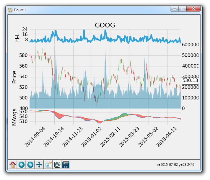
太棒了,到目前为止还不错。 接下来,我们可能要删除新y轴上的标签,然后我们也可能不想让交易量占用太多空间。 没问题:
首先:
ax2v.axes.yaxis.set_ticklabels([])
上面将y刻度标签设置为一个空列表,所以不会有任何标签了。
译者注:所以将标签删除之后,添加新轴的意义是什么?直接在原轴域上绘图就可以了。
接下来,我们可能要将网格设置为false,使轴域上不会有双网格:
ax2v.grid(False)
最后,为了处理交易量占用很多空间,我们可以做以下操作:
ax2v.set_ylim(0, 3*volume.max())
所以这设置y轴显示范围从 0 到交易量的最大值的 3 倍。 这意味着,在最高点,交易量最多可占据图形的33%。 所以,增加volume.max的倍数越多,空间就越小/越少。
现在,我们的图表为:
import matplotlib.pyplot as plt
import matplotlib.dates as mdates
import matplotlib.ticker as mticker
from matplotlib.finance import candlestick_ohlc
from matplotlib import style

import numpy as np
import urllib
import datetime as dt

style.use('fivethirtyeight')
print(plt.style.available)

print(plt.__file__)

MA1 = 10
MA2 = 30

def moving_average(values, window):
    weights = np.repeat(1.0, window)/window
    smas = np.convolve(values, weights, 'valid')
    return smas

def high_minus_low(highs, lows):
    return highs-lows


def bytespdate2num(fmt, encoding='utf-8'):
    strconverter = mdates.strpdate2num(fmt)
    def bytesconverter(b):
        s = b.decode(encoding)
        return strconverter(s)
    return bytesconverter


def graph_data(stock):

    fig = plt.figure()
    ax1 = plt.subplot2grid((6,1), (0,0), rowspan=1, colspan=1)
    plt.title(stock)
    plt.ylabel('H-L')
    ax2 = plt.subplot2grid((6,1), (1,0), rowspan=4, colspan=1, sharex=ax1)
    plt.ylabel('Price')
    ax2v = ax2.twinx()

    ax3 = plt.subplot2grid((6,1), (5,0), rowspan=1, colspan=1, sharex=ax1)
    plt.ylabel('MAvgs')


    stock_price_url = 'http://chartapi.finance.yahoo.com/instrument/1.0/'+stock+'/chartdata;type=quote;range=1y/csv'
    source_code = urllib.request.urlopen(stock_price_url).read().decode()
    stock_data = []
    split_source = source_code.split('\n')
    for line in split_source:
        split_line = line.split(',')
        if len(split_line) == 6:
            if 'values' not in line and 'labels' not in line:
                stock_data.append(line)


    date, closep, highp, lowp, openp, volume = np.loadtxt(stock_data,
                                                          delimiter=',',
                                                          unpack=True,
                                                          converters={0: bytespdate2num('%Y%m%d')})

    x = 0
    y = len(date)
    ohlc = []

    while x < y:
        append_me = date[x], openp[x], highp[x], lowp[x], closep[x], volume[x]
        ohlc.append(append_me)
        x+=1

    ma1 = moving_average(closep,MA1)
    ma2 = moving_average(closep,MA2)
    start = len(date[MA2-1:])

    h_l = list(map(high_minus_low, highp, lowp))


    ax1.plot_date(date[-start:],h_l[-start:],'-')
    ax1.yaxis.set_major_locator(mticker.MaxNLocator(nbins=4, prune='lower'))


    candlestick_ohlc(ax2, ohlc[-start:], width=0.4, colorup='#77d879', colordown='#db3f3f')


    ax2.yaxis.set_major_locator(mticker.MaxNLocator(nbins=7, prune='upper'))
    ax2.grid(True)

    bbox_props = dict(boxstyle='round',fc='w', ec='k',lw=1)

    ax2.annotate(str(closep[-1]), (date[-1], closep[-1]),
                 xytext = (date[-1]+5, closep[-1]), bbox=bbox_props)

##    # Annotation example with arrow
##    ax2.annotate('Bad News!',(date[11],highp[11]),
##                 xytext=(0.8, 0.9), textcoords='axes fraction',
##                 arrowprops = dict(facecolor='grey',color='grey'))
##
##
##    # Font dict example
##    font_dict = {'family':'serif',
##                 'color':'darkred',
##                 'size':15}
##    # Hard coded text
##    ax2.text(date[10], closep[1],'Text Example', fontdict=font_dict)

    ax2v.fill_between(date[-start:],0, volume[-start:], facecolor='#0079a3', alpha=0.4)
    ax2v.axes.yaxis.set_ticklabels([])
    ax2v.grid(False)
    ax2v.set_ylim(0, 3*volume.max())


    ax3.plot(date[-start:], ma1[-start:], linewidth=1)
    ax3.plot(date[-start:], ma2[-start:], linewidth=1)

    ax3.fill_between(date[-start:], ma2[-start:], ma1[-start:],
                     where=(ma1[-start:] < ma2[-start:]),
                     facecolor='r', edgecolor='r', alpha=0.5)

    ax3.fill_between(date[-start:], ma2[-start:], ma1[-start:],
                     where=(ma1[-start:] > ma2[-start:]),
                     facecolor='g', edgecolor='g', alpha=0.5)

    ax3.xaxis.set_major_formatter(mdates.DateFormatter('%Y-%m-%d'))
    ax3.xaxis.set_major_locator(mticker.MaxNLocator(10))
    ax3.yaxis.set_major_locator(mticker.MaxNLocator(nbins=4, prune='upper'))

    for label in ax3.xaxis.get_ticklabels():
        label.set_rotation(45)


    plt.setp(ax1.get_xticklabels(), visible=False)
    plt.setp(ax2.get_xticklabels(), visible=False)
    plt.subplots_adjust(left=0.11, bottom=0.24, right=0.90, top=0.90, wspace=0.2, hspace=0)
    plt.show()


graph_data('GOOG')
到这里,我们差不多完成了。 这里唯一的缺陷是一个好的图例。 一些线条是显而易见的,但人们可能会好奇移动均值的参数是什么,我们这里是 10 和 30。 添加自定义图例是下一个教程中涉及的内容。