六、SciPy 统计推断
原文:statistical-inference-scipy
译者:飞龙
6.1 效应量
署名:派生于 Allen Downey 的 CompStats。协议:Creative Commons Attribution 4.0 International。
from __future__ import print_function, division

import numpy
import scipy.stats

import matplotlib.pyplot as pyplot

from IPython.html.widgets import interact, fixed
from IPython.html import widgets

# 为随机数生成器播种,所以我们得到相同结果
numpy.random.seed(17)

# 来自 http://colorbrewer2.org/ 的一些漂亮的颜色
COLOR1 = '#7fc97f'
COLOR2 = '#beaed4'
COLOR3 = '#fdc086'
COLOR4 = '#ffff99'
COLOR5 = '#386cb0'

%matplotlib inline
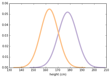
为了探索量化效应量的统计量,我们将研究男女之间的身高差异。 我使用来自行为风险因素监测系统(BRFSS)的数据,来估计美国成年女性和男性的身高的平均值和标准差(cm)。
我将使用scipy.stats.norm来表示分布。结果是一个rv对象(代表随机变量)。
mu1, sig1 = 178, 7.7
male_height = scipy.stats.norm(mu1, sig1)

mu2, sig2 = 163, 7.3
female_height = scipy.stats.norm(mu2, sig2)
以下函数在平均值的 4 个标准差内评估正态(高斯)概率密度函数(PDF)。它需要rv对象并返回一对 NumPy 数组。
def eval_pdf(rv, num=4):
    mean, std = rv.mean(), rv.std()
    xs = numpy.linspace(mean - num*std, mean + num*std, 100)
    ys = rv.pdf(xs)
    return xs, ys
这是两个分布的样子。
xs, ys = eval_pdf(male_height)
pyplot.plot(xs, ys, label='male', linewidth=4, color=COLOR2)

xs, ys = eval_pdf(female_height)
pyplot.plot(xs, ys, label='female', linewidth=4, color=COLOR3)
pyplot.xlabel('height (cm)')
None
我们现在假设这些是总体的真实分布。当然,在现实生活中,我们从未观察到真实的总体分布。我们通常需要使用随机样本。
我将使用rvs从总体分布中生成随机样本。请注意,这些是完全随机的,完全有代表性的样品,没有测量误差!
male_sample = male_height.rvs(1000)

female_sample = female_height.rvs(1000)
两个样本都是 NumPy 数组。 现在我们可以计算样本统计量,如均值和标准差。
mean1, std1 = male_sample.mean(), male_sample.std()
mean1, std1

# (178.16511665818112, 7.8419961712899502)
样本均值接近总体均值,但不如预期的那样精确。
mean2, std2 = female_sample.mean(), female_sample.std()
mean2, std2

# (163.48610226651135, 7.382384919896662)
女性样本的结果相似。
Now, there are many ways to describe the magnitude of the difference between these distributions. An obvious one is the difference in the means:
difference_in_means = male_sample.mean() - female_sample.mean()
difference_in_means # 单位为厘米

# 14.679014391669767
平均而言,男性高出 14 至 15 厘米。对于某些应用,这将是描述差异的好方法,但存在一些问题:
如果不了解更多关于分布的信息(比如标准差),很难解释 15 厘米之间的差异是否很大。
差异的大小取决于度量单位,因此很难在不同的研究中进行比较。
有许多方法可以量化分布之间的差异。 一个简单的选择是将差异表示为平均值的百分比。
# 练习:均值的相对差异,表示成百分比是什么?

relative_difference = difference_in_means / male_sample.mean()
relative_difference * 100   # 百分比
# 8.2389946286916569
但是相对差异的一个问题是你必须选择,相对于哪个均值来表达它们。
relative_difference = difference_in_means / female_sample.mean()
relative_difference * 100    # 百分比
# 8.9787536605040401
第二部分
表达分布之间差异的另一种方法是查看它们重叠的程度。为了定义重叠,我们在两个均值之间选择一个阈值。简单的阈值是均值之间的中点:
simple_thresh = (mean1 + mean2) / 2
simple_thresh

# 170.82560946234622
一个更好但更复杂的阈值是 PDF 交叉的地方。
thresh = (std1 * mean2 + std2 * mean1) / (std1 + std2)
thresh

# 170.6040359174722
在此示例中,两个阈值之间没有太大差异。
现在我们可以算出有多少男性低于阈值:
male_below_thresh = sum(male_sample < thresh)
male_below_thresh

# 164
有多少女性高于它:
female_above_thresh = sum(female_sample > thresh)
female_above_thresh

# 174
“重叠”是曲线下面的总面积,最终位于阈值的右侧。
overlap = male_below_thresh / len(male_sample) + female_above_thresh / len(female_sample)
overlap

# 0.33799999999999997
或者在更实际的术语中,如果你尝试使用高度来猜测性别,你可能会报告错误分类的人数:
misclassification_rate = overlap / 2
misclassification_rate

# 0.16899999999999998
量化分布之间差异的另一种方法,是所谓的“优势概率”,这是一个有问题的术语,但在这种情况下,随机选择的男性比随机选择的女性更高的概率。
# 练习:假设我随机选择男性和女性。
# 男性更高的概率是什么?
sum(x > y for x, y in zip(male_sample, female_sample)) / len(male_sample)

# 0.91100000000000003
重叠(或错误分类率)和“优势概率”有两个好的属性:
作为概率,它们不依赖于度量单位,因此它们在研究之间具有可比性。
它们以操作术语表达,因此读者可以了解差异所产生的实际效果。
还有另一种表达分布差异的常用方法。科恩的d是均值的差,通过除以标准差来标准化。这是一个计算它的函数:
def CohenEffectSize(group1, group2):
    """计算 Cohen d。

    group1: Series 或 NumPy 数组
    group2: Series 或 NumPy 数组

    返回值: float
    """
    diff = group1.mean() - group2.mean()

    n1, n2 = len(group1), len(group2)
    var1 = group1.var()
    var2 = group2.var()

    pooled_var = (n1 * var1 + n2 * var2) / (n1 + n2)
    d = diff / numpy.sqrt(pooled_var)
    return d
计算分母有点复杂; 事实上,人们提出了几种方法来做到这一点。 该实现使用“池化标准差”,其是两组标准差的加权平均值。
这是男女之间身高差异的结果。
CohenEffectSize(male_sample, female_sample)
1.9274780043619493
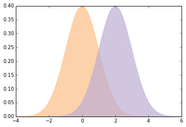
大多数人都不太了解d = 1.9是多么大,所以让我们做一个可视化来校准。
这是一个函数,它封装了我们已经看到的用于计算重叠和优势概率的代码。
def overlap_superiority(control, treatment, n=1000):
    """基于样本估计重叠和有时。

    control: scipy.stats rv 对象
    treatment: scipy.stats rv 对象
    n: 样本大小
    """
    control_sample = control.rvs(n)
    treatment_sample = treatment.rvs(n)
    thresh = (control.mean() + treatment.mean()) / 2

    control_above = sum(control_sample > thresh)
    treatment_below = sum(treatment_sample < thresh)
    overlap = (control_above + treatment_below) / n

    superiority = sum(x > y for x, y in zip(treatment_sample, control_sample)) / n
    return overlap, superiority
这是使用 Cohen 的d的函数,绘制具有给定效应量的正态分布,并打印它们的重叠和优势。
def plot_pdfs(cohen_d=2):
    """为标准差不同的分布绘制 PDF。

    cohen_d: 均值之间的标准差
    """
    control = scipy.stats.norm(0, 1)
    treatment = scipy.stats.norm(cohen_d, 1)
    xs, ys = eval_pdf(control)
    pyplot.fill_between(xs, ys, label='control', color=COLOR3, alpha=0.7)

    xs, ys = eval_pdf(treatment)
    pyplot.fill_between(xs, ys, label='treatment', color=COLOR2, alpha=0.7)

    o, s = overlap_superiority(control, treatment)
    print('overlap', o)
    print('superiority', s)
这是一个演示函数的示例:
plot_pdfs(2)

'''
overlap 0.278
superiority 0.932
'''

你可以使用交互式组件来显示d的不同值的含义:
slider = widgets.FloatSliderWidget(min=0, max=4, value=2)
interact(plot_pdfs, cohen_d=slider)
None

'''
overlap 0.305
superiority 0.931
'''
Cohen 的d有一些不错的属性:
因为平均值和标准差具有相同的单位,它们的比例是无量纲的,所以我们可以比较不同研究中的
d。在通常使用
d的字段中,人们会进行校准,来了解哪些值应该被认为是大的,令人惊讶的或重要的。给定
d(并假设分布是正态),你可以计算重叠,优势和相关统计量。
总之,报告效应量的最佳方式通常取决于受众和你的目标。通常在具有良好技术属性的摘要统计量,和对一般受众有意义的统计量之间进行权衡。
6.2 随机采样
署名:派生于 Allen Downey 的 CompStats。协议:Creative Commons Attribution 4.0 International。
from __future__ import print_function, division

import numpy
import scipy.stats

import matplotlib.pyplot as pyplot

from IPython.html.widgets import interact, fixed
from IPython.html import widgets

# 为随机数生成器播种,所以我们得到相同结果
numpy.random.seed(18)

# 来自 http://colorbrewer2.org/ 一些漂亮的颜色
COLOR1 = '#7fc97f'
COLOR2 = '#beaed4'
COLOR3 = '#fdc086'
COLOR4 = '#ffff99'
COLOR5 = '#386cb0'

%matplotlib inline
第一部分
假设我们想估计美国男女的平均体重。我们希望量化估计的不确定性。一种方法是模拟许多实验,并观察从一个实验到下一个实验的结果变化有多大。
我将从不切实际的假设开始,即我们知道总体中体重的实际分布。然后我将展示如何在没有这个假设的情况下解决问题。
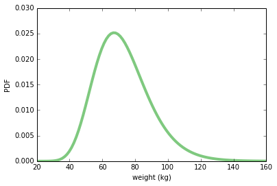
根据 BRFSS 的数据,我发现美国女性的体重(千克)分布,可以由对数正态分布模拟得很好,其参数如下:
weight = scipy.stats.lognorm(0.23, 0, 70.8)
weight.mean(), weight.std()

# (72.697645732966876, 16.944043048498038)
这是分布的样子:
xs = numpy.linspace(20, 160, 100)
ys = weight.pdf(xs)
pyplot.plot(xs, ys, linewidth=4, color=COLOR1)
pyplot.xlabel('weight (kg)')
pyplot.ylabel('PDF')
None
make_sample从此分布中抽取随机样本。 结果是 NumPy 数组。
def make_sample(n=100):
    sample = weight.rvs(n)
    return sample
这是一个n = 100的例子。 样本的均值和标准差接近总体均值和标准差,但不准确。
sample = make_sample(n=100)
sample.mean(), sample.std()

# (76.308293640077437, 19.995558735561865)
我们想估计总体中的平均体重,因此我们将使用的“样本统计量”是均值:
def sample_stat(sample):
    return sample.mean()
“实验”的一次迭代是收集 100 名女性的样本并计算他们的平均体重。我们可以模拟多次运行此实验,并收集样本统计量的列表。 结果是NumPy数组。
def compute_sample_statistics(n=100, iters=1000):
    stats = [sample_stat(make_sample(n)) for i in range(iters)]
    return numpy.array(stats)
下一行运行模拟 1000 次并将结果放在sample_means中:
sample_means = compute_sample_statistics(n=100, iters=1000)
让我们看一下样本均值的分布。 此分布显示了从一个实验到下一个实验的结果有多大差异。
请记住,这种分布与总体中的体重分布不同。这是重复虚拟实验的结果分布。
pyplot.hist(sample_means, color=COLOR5)
pyplot.xlabel('sample mean (n=100)')
pyplot.ylabel('count')
None
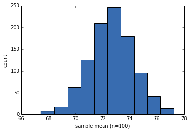
样本均值接近实际总体均值,这很好,但实际上并不重要。
sample_means.mean()

# 72.652052080657413
样本的标准差量化了从一个实验到下一个实验的可变性,并反映了估计的精确度。该数量称为“标准误差”。
std_err = sample_means.std()
std_err

# 1.6355262477017491
我们还可以使用样本均值的分布来计算“90% 置信区间”,其中包含 90% 的实验结果:
conf_int = numpy.percentile(sample_means, [5, 95])
conf_int

# array([ 69.92149384,  75.40866638])
以下函数接受一组样本统计量并打印 SE 和 CI:
def summarize_sampling_distribution(sample_stats):
    print('SE', sample_stats.std())
    print('90% CI', numpy.percentile(sample_stats, [5, 95]))
这里是它的样子:
summarize_sampling_distribution(sample_means)

'''
SE 1.6355262477
90% CI [ 69.92149384  75.40866638]
'''
现在我们想看看当我们改变样本大小n时会发生什么。以下函数接受n,运行 1000 个模拟实验,并汇总结果。
def plot_sample_stats(n, xlim=None):
    sample_stats = compute_sample_statistics(n, iters=1000)
    summarize_sampling_distribution(sample_stats)
    pyplot.hist(sample_stats, color=COLOR2)
    pyplot.xlabel('sample statistic')
    pyplot.xlim(xlim)
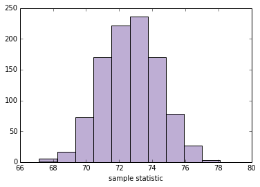
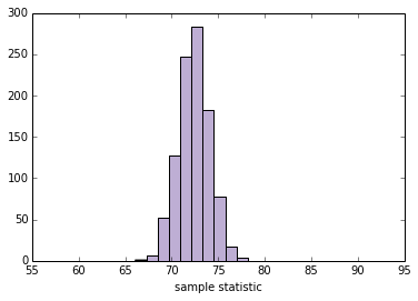
这是n = 100的测试:
plot_sample_stats(100)

'''
SE 1.71202891175
90% CI [ 69.96057332  75.58582662]
'''
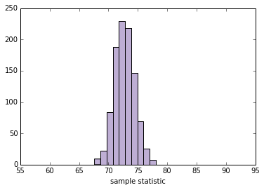
现在我们可以使用interact和不同的n值来运行plot_sample_stats。注意:xlim设置x轴的限制。
def sample_stat(sample):
    return sample.mean()

slider = widgets.IntSliderWidget(min=10, max=1000, value=100)
interact(plot_sample_stats, n=slider, xlim=fixed([55, 95]))
None

'''
SE 1.71314776815
90% CI [ 69.99274896  75.65943185]
'''
此框架适用于我们想要估计的任何其他数量。通过更改sample_stat,你可以计算任何样本统计量的 SE 和 CI。
作为练习,请使用以下任何统计量填写下面的sample_stat:
- 样本标准差
- 变异系数,即样本标准差除以样本标准均值。
- 最小值或最大值
- 中位数(第 50 个百分位数)
- 第 10 或 90 个百分位数
- 四分位数间距(IQR),即第 75 和第 25 百分位数之间的差。
你可能会发现有用的 NumPy 数组方法包括std,min,max和percentile。根据结果,你可能需要调整xlim。
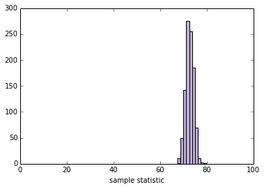
def sample_stat(sample):
    # TODO:将下面一行替换为其它样本统计量
    return sample.mean()

slider = widgets.IntSliderWidget(min=10, max=1000, value=100)
interact(plot_sample_stats, n=slider, xlim=fixed([0, 100]))
None

'''
SE 1.67195986148
90% CI [ 69.82954731  75.32184298]
'''
第二部分
到目前为止,我们已经证明,如果我们知道总体的实际分布,我们可以计算任何样本统计量的抽样分布,从中我们可以计算 SE 和 CI。
但在现实生活中,我们并不知道总体的实际分布。 如果我们这样做,我们就不需要估计了!
在现实生活中,我们使用样本建立总体分布的模型,然后使用该模型生成抽样分布。一种简单而流行的方法是“重采样”,这意味着我们将样本本身用作总体分布的模型并从中抽取样本。
在继续之前,我想收集第一部分中的一些代码并将其组织为一个类。 此类表示用于计算采样分布的框架。
class Resampler(object):
    """表示计算采样分布的框架。"""

    def __init__(self, sample, xlim=None):
        """储存实际样本。"""
        self.sample = sample
        self.n = len(sample)
        self.xlim = xlim

    def resample(self):
        """通过带放回地选择原始样本生成新样本。
        """
        new_sample = numpy.random.choice(self.sample, self.n, replace=True)
        return new_sample

    def sample_stat(self, sample):
        """计算样本统计量,使用原始样本或者模拟样本。
        """
        return sample.mean()

    def compute_sample_statistics(self, iters=1000):
        """模拟许多实验并收集所得样本统计量。
        """
        stats = [self.sample_stat(self.resample()) for i in range(iters)]
        return numpy.array(stats)

    def plot_sample_stats(self):
        """运行模拟的实验,并汇总结果。
        """
        sample_stats = self.compute_sample_statistics()
        summarize_sampling_distribution(sample_stats)
        pyplot.hist(sample_stats, color=COLOR2)
        pyplot.xlabel('sample statistic')
        pyplot.xlim(self.xlim)
以下函数实例化一个Resampler并运行它。
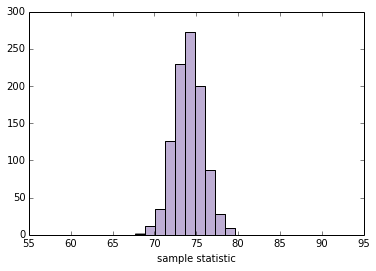
def plot_resampled_stats(n=100):
    sample = weight.rvs(n)
    resampler = Resampler(sample, xlim=[55, 95])
    resampler.plot_sample_stats()
这是一个n = 100的测试:
plot_resampled_stats(100)

'''
SE 1.72606450921
90% CI [ 71.35648645  76.82647135]
'''
现在我们可以在交互中使用plot_resampled_stats:
slider = widgets.IntSliderWidget(min=10, max=1000, value=100)
interact(plot_resampled_stats, n=slider, xlim=fixed([1, 15]))
None

'''
SE 1.67407589545
90% CI [ 69.60129748  75.13161693]
'''
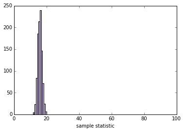
练习:编写一个名为StdResampler的新类,它继承自Resampler并覆盖sample_stat,因此它计算重采样数据的标准差。
class StdResampler(Resampler):
    """计算标准差的采样分布。"""

    def sample_stat(self, sample):
        """计算样本统计量,使用原始样本或者模拟样本。
        """
        return sample.std()
使用下面的单元格测试你的代码:
def plot_resampled_stats(n=100):
    sample = weight.rvs(n)
    resampler = StdResampler(sample, xlim=[0, 100])
    resampler.plot_sample_stats()

plot_resampled_stats()

'''
SE 1.30056137605
90% CI [ 13.70615766  18.05008376]
'''
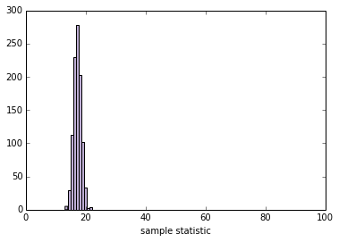
当你的StdResampler能用时,你应该能够与它进行交互:
slider = widgets.IntSliderWidget(min=10, max=1000, value=100)
interact(plot_resampled_stats, n=slider)
None

'''
SE 1.29095098626
90% CI [ 15.13442137  19.27452588]
'''
第三部分
我们可以扩展这个框架来计算 SE 和 CI,来获得均值的差。例如,男性平均比女性重。以下是女性的分布(来自 BRFSS 数据):
female_weight = scipy.stats.lognorm(0.23, 0, 70.8)
female_weight.mean(), female_weight.std()

# (72.697645732966876, 16.944043048498038)
这是男性的分布:
male_weight = scipy.stats.lognorm(0.20, 0, 87.3)
male_weight.mean(), male_weight.std()

# (89.063576984335782, 17.992335889366288)
我将模拟 100 名男性和 100 名女性的样本:
female_sample = female_weight.rvs(100)
male_sample = male_weight.rvs(100)
平均值的差应为 17 千克左右,但从一个随机样本到另一个会有所不同:
male_sample.mean() - female_sample.mean()

# 15.521337537414979
这是计算 Cohen 的d的函数:
def CohenEffectSize(group1, group2):
    """计算 Cohen d。

    group1: Series 或 NumPy 数组
    group2: Series 或 NumPy 数组

    返回值: float
    """
    diff = group1.mean() - group2.mean()

    n1, n2 = len(group1), len(group2)
    var1 = group1.var()
    var2 = group2.var()

    pooled_var = (n1 * var1 + n2 * var2) / (n1 + n2)
    d = diff / numpy.sqrt(pooled_var)
    return d
男女之间的体重差异约为 1 个标准差:
CohenEffectSize(male_sample, female_sample)

# 0.9271315108152719
现在我们可以编写一个版本的Resampler来计算d的采样分布。
class CohenResampler(Resampler):
    def __init__(self, group1, group2, xlim=None):
        self.group1 = group1
        self.group2 = group2
        self.xlim = xlim

    def resample(self):
        group1 = numpy.random.choice(self.group1, len(self.group1), replace=True)
        group2 = numpy.random.choice(self.group2, len(self.group2), replace=True)
        return group1, group2

    def sample_stat(self, groups):
        group1, group2 = groups
        return CohenEffectSize(group1, group2)

    # 注:下面的函数和 Resampler 中相同,
    # 所以我可以仅仅继承它,但是我为了可读性而包含它
    def compute_sample_statistics(self, iters=1000):
        stats = [self.sample_stat(self.resample()) for i in range(iters)]
        return numpy.array(stats)

    def plot_sample_stats(self):
        sample_stats = self.compute_sample_statistics()
        summarize_sampling_distribution(sample_stats)
        pyplot.hist(sample_stats, color=COLOR2)
        pyplot.xlabel('sample statistic')
        pyplot.xlim(self.xlim)
现在我们可以实例化一个CohenResampler并绘制采样分布。
resampler = CohenResampler(male_sample, female_sample)
resampler.plot_sample_stats()

'''
SE 0.160707033098
90% CI [ 0.6808076  1.1974013]
'''
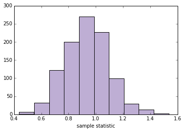
该示例展示了计算框架优于数学分析的优点。Cohen 的d等统计量是其他统计量的比率,相对难以分析。 但是通过计算方法,所有样本统计量都同样“容易”。
关于词汇的一个注解:我在这里称之为“重采样”的东西,是一种称为“自举”的特定重采样。其他技术也考虑重新采样,包括置换检验,我们将在下一节中看到,以及“jackknife”重采样。 你可以在 http://en.wikipedia.org/wiki/Resampling_(statistics) 上阅读更多内容。
6.3 假设检验
署名:派生于 Allen Downey 的 CompStats。协议:Creative Commons Attribution 4.0 International。
from __future__ import print_function, division

import numpy
import scipy.stats

import matplotlib.pyplot as pyplot

from IPython.html.widgets import interact, fixed
from IPython.html import widgets

import first

# 为随机数生成器播种,所以我们得到相同结果
numpy.random.seed(19)

# 来自 http://colorbrewer2.org/ 的一些漂亮的颜色
COLOR1 = '#7fc97f'
COLOR2 = '#beaed4'
COLOR3 = '#fdc086'
COLOR4 = '#ffff99'
COLOR5 = '#386cb0'

%matplotlib inline
第一部分
作为一个例子,让我们看看分组之间的差异。 我在 Think Stats 中使用的例子是与其他婴儿相比的第一个婴儿。first模块提供代码,将数据读入三个 pandas 数据帧。
live, firsts, others = first.MakeFrames()
我们感兴趣的表观效应是均值的差异。其他示例可能包括变量之间的相关性或线性回归中的系数。量化效应量的数字,无论它是什么,都是“测试统计量”。
def TestStatistic(data):
    group1, group2 = data
    test_stat = abs(group1.mean() - group2.mean())
    return test_stat
对于第一个例子,我提取了第一个婴儿和其他人的怀孕时间。结果是 pandas Series对象。
group1 = firsts.prglngth
group2 = others.prglngth
平均值的实际差异为 0.078 周,仅为13小时。
actual = TestStatistic((group1, group2))
actual

# 0.078037266777549519
零假设是组之间没有差异。我们可以通过形成包括第一个婴儿和其他婴儿的合并样本来对其进行建模。
n, m = len(group1), len(group2)
pool = numpy.hstack((group1, group2))
然后我们可以通过打乱池子,并将其分成两组来模拟零假设,使用与实际样本相同的大小。
def RunModel():
    numpy.random.shuffle(pool)
    data = pool[:n], pool[n:]
    return data
运行该模型的结果是两个 NumPy 数组,其具有打乱的孕期长度:
RunModel()

# (array([36, 40, 39, ..., 43, 42, 40]), array([43, 39, 32, ..., 37, 35, 41]))
然后我们使用模拟数据计算相同的测试统计量:
TestStatistic(RunModel())

# 0.081758440969863955
如果我们运行模型 1000 次并计算测试统计量,我们可以看到测试统计量在零假设下变化了多少。
test_stats = numpy.array([TestStatistic(RunModel()) for i in range(1000)])
test_stats.shape

# (1000,)
这是零假设下的检验统计量的抽样分布,其中均值的实际差异用灰线表示。
def VertLine(x):
    """在 x 处绘制竖直线。"""
    pyplot.plot([x, x], [0, 300], linewidth=3, color='0.8')

VertLine(actual)
pyplot.hist(test_stats, color=COLOR5)
pyplot.xlabel('difference in means')
pyplot.ylabel('count')
None
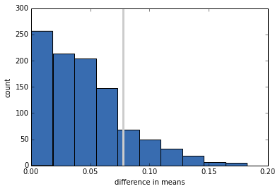
p 值是零假设下的检验统计量超过实际值的概率。
pvalue = sum(test_stats >= actual) / len(test_stats)
pvalue

# 0.14999999999999999
在这种情况下,结果约为 15%,这意味着即使两组之间没有差异,我们也可以看到样本差异大到 0.078 周。
我们的结论是,表观效应可能是偶然的,所以我们不相信它会出现在一般总体或同一总体的另一个样本中。
第二部分
我们可以从上一节中获取部分,并将它们组织在一个表示假设检验结构的类中。
class HypothesisTest(object):
    """表示假设检验。"""

    def __init__(self, data):
        """初始化。

        data: 任何格式相关的数据
        """
        self.data = data
        self.MakeModel()
        self.actual = self.TestStatistic(data)
        self.test_stats = None

    def PValue(self, iters=1000):
        """计算测试统计量的分布和 p 值。

        iters: 迭代数

        返回值: float p 值
        """
        self.test_stats = numpy.array([self.TestStatistic(self.RunModel())
                                       for _ in range(iters)])

        count = sum(self.test_stats >= self.actual)
        return count / iters

    def MaxTestStat(self):
        """返回模拟期间见到的最大的测试统计量。
        """
        return max(self.test_stats)

    def PlotHist(self, label=None):
        """使用观测测试统计量处的竖直线条绘制 Cdf。
        """
        def VertLine(x):
            """在 x 处绘制竖直线条。"""
            pyplot.plot([x, x], [0, max(ys)], linewidth=3, color='0.8')

        ys, xs, patches = pyplot.hist(ht.test_stats, color=COLOR4)
        VertLine(self.actual)
        pyplot.xlabel('test statistic')
        pyplot.ylabel('count')

    def TestStatistic(self, data):
        """计算测试统计量。

        data: 任何格式相关的数据
        """
        raise UnimplementedMethodException()

    def MakeModel(self):
        """为零假设构建模型
        """
        pass

    def RunModel(self):
        """运行零假设的模型。

        返回值: 模拟的数据
        """
        raise UnimplementedMethodException()
HypothesisTest是一个对模板进行编码的抽象父类。子类填写缺少的方法。 例如,这是上一节的测试。
class DiffMeansPermute(HypothesisTest):
    """通过置换测试均值差异。"""

    def TestStatistic(self, data):
        """计算测试统计量.

        data: 任何格式相关的数据
        """
        group1, group2 = data
        test_stat = abs(group1.mean() - group2.mean())
        return test_stat

    def MakeModel(self):
        """构建零假设的模型。
        """
        group1, group2 = self.data
        self.n, self.m = len(group1), len(group2)
        self.pool = numpy.hstack((group1, group2))

    def RunModel(self):
        """运行零假设的模型。

        返回值: 模拟的数据
        """
        numpy.random.shuffle(self.pool)
        data = self.pool[:self.n], self.pool[self.n:]
        return data
现在我们可以通过实例化DiffMeansPermute对象来运行测试:
data = (firsts.prglngth, others.prglngth)
ht = DiffMeansPermute(data)
p_value = ht.PValue(iters=1000)
print('\nmeans permute pregnancy length')
print('p-value =', p_value)
print('actual =', ht.actual)
print('ts max =', ht.MaxTestStat())
means permute pregnancy length p-value = 0.16 actual = 0.0780372667775 ts max = 0.173695697482
我们可以在零假设下绘制检验统计量的抽样分布。
ht.PlotHist()
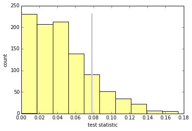
作为练习,编写一个名为DiffStdPermute的类,它扩展了DiffMeansPermute并覆盖TestStatistic来计算标准差的差异。标准差的差异是否具有统计学意义?
class DiffStdPermute(DiffMeansPermute):
    """通过置换测试均值差异。"""

    def TestStatistic(self, data):
        """计算测试统计量。

        data: 任何格式相关的数据
        """
        group1, group2 = data
        test_stat = abs(group1.std() - group2.std())
        return test_stat

data = (firsts.prglngth, others.prglngth)
ht = DiffStdPermute(data)
p_value = ht.PValue(iters=1000)
print('\nstd permute pregnancy length')
print('p-value =', p_value)
print('actual =', ht.actual)
print('ts max =', ht.MaxTestStat())

'''
std permute pregnancy length
p-value = 0.155
actual = 0.176049064229
ts max = 0.44299505029
'''
现在让我们再次运行DiffMeansPermute,看看第一胎和其他婴儿的出生体重是否有差异。
data = (firsts.totalwgt_lb.dropna(), others.totalwgt_lb.dropna())
ht = DiffMeansPermute(data)
p_value = ht.PValue(iters=1000)
print('\nmeans permute birthweight')
print('p-value =', p_value)
print('actual =', ht.actual)
print('ts max =', ht.MaxTestStat())

'''
means permute birthweight
p-value = 0.0
actual = 0.124761184535
ts max = 0.0917504268392
'''
在这种情况下,在 1000 次尝试之后,我们从未看到与观察到的差异一样大的样本差异,因此我们得出结论,表观效应不太可能在零假设下。在正常情况下,我们也可以推断出表观效应不太可能是由随机抽样引起的。
最后一点:在这种情况下,我会报告p值小于 1/1000 或 0.001。 我不会报告p = 0,因为在零假设下,标贯效应并非不可能,而是不太可能。
这个笔记本由 Donne Martin 编写。来源和协议信息在 GitHub 上。