8.12 文本和注解
译者:飞龙
本节是《Python 数据科学手册》(Python Data Science Handbook)的摘录。
创建良好的可视化涉及引导读者并使图形讲述故事。在某些情况下,可以以完全可视的方式讲述这个故事,而不需要添加文本,但在其他情况下,需要小的文本提示和标签。也许你将使用的最基本的注释类型是轴标签和标题,但选项超出了这个范围。让我们看看一些数据,以及我们如何可视化和注释它,来有助于传达有趣的信息。 我们首先设置笔记本来绘图并导入我们将使用的函数:
%matplotlib inline
import matplotlib.pyplot as plt
import matplotlib as mpl
plt.style.use('seaborn-whitegrid')
import numpy as np
import pandas as pd
示例: 美国新生儿的假期效应
让我们回到之前处理的一些数据,在“示例:出生率数据”中,我们在日历年上生成了平均出生率的图表;如前所述,这些数据可以在 https://raw.githubusercontent.com/jakevdp/data-CDCbirths/master/births.csv 下载。
我们将使用我们在那里使用的相同清理过程开始,并绘制结果:
births = pd.read_csv('data/births.csv')
quartiles = np.percentile(births['births'], [25, 50, 75])
mu, sig = quartiles[1], 0.74 * (quartiles[2] - quartiles[0])
births = births.query('(births > @mu - 5 * @sig) & (births < @mu + 5 * @sig)')
births['day'] = births['day'].astype(int)
births.index = pd.to_datetime(10000 * births.year +
100 * births.month +
births.day, format='%Y%m%d')
births_by_date = births.pivot_table('births',
[births.index.month, births.index.day])
births_by_date.index = [pd.datetime(2012, month, day)
for (month, day) in births_by_date.index]
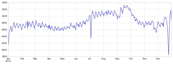
fig, ax = plt.subplots(figsize=(12, 4))
births_by_date.plot(ax=ax);
When we're communicating data like this, it is often useful to annotate certain features of the plot to draw the reader's attention.
This can be done manually with the plt.text/ax.text command, which will place text at a particular x/y value:
fig, ax = plt.subplots(figsize=(12, 4))
births_by_date.plot(ax=ax)

# 向绘图添加标签
style = dict(size=10, color='gray')

ax.text('2012-1-1', 3950, "New Year's Day", **style)
ax.text('2012-7-4', 4250, "Independence Day", ha='center', **style)
ax.text('2012-9-4', 4850, "Labor Day", ha='center', **style)
ax.text('2012-10-31', 4600, "Halloween", ha='right', **style)
ax.text('2012-11-25', 4450, "Thanksgiving", ha='center', **style)
ax.text('2012-12-25', 3850, "Christmas ", ha='right', **style)

# 标记轴域
ax.set(title='USA births by day of year (1969-1988)',
       ylabel='average daily births')

# 使用中心化的月标签将 x 轴格式化
ax.xaxis.set_major_locator(mpl.dates.MonthLocator())
ax.xaxis.set_minor_locator(mpl.dates.MonthLocator(bymonthday=15))
ax.xaxis.set_major_formatter(plt.NullFormatter())
ax.xaxis.set_minor_formatter(mpl.dates.DateFormatter('%h'));
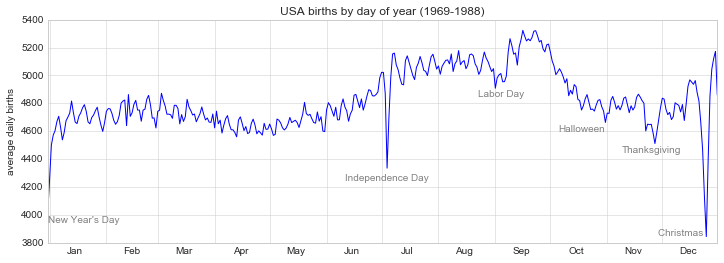
ax.text方法接受x位置,y位置,字符串,然后是可选关键字,指定文本的颜色,大小,样式,对齐方式和其他属性。在这里,我们使用ha='right'和ha='center',其中ha是 horizonal alignment 的缩写。可用选项的更多信息,请参阅plt.text()和mpl.text.Text()的文档字符串。
变换和文本位置
在前面的示例中,我们将文本注释锚定到数据位置。 有时最好将文本锚定到轴或图上的位置,与数据无关。在 Matplotlib 中,这是通过修改变换来完成的。
任何图形显示框架都需要一些在坐标系之间进行转换的方案。例如,(x, y) = (1, 1)处的数据点,需要以某种方式表示在图上的某个位置,而该位置又需要在屏幕上以像素表示。在数学上,这种坐标转换相对简单,Matplotlib 有一套完善的工具,它们在内部使用来执行(这些工具可以在matplotlib.transforms子模块中进行探索)。
普通用户很少需要关心这些变换的细节,但在考虑在图形上放置文本时,它是有用的知识。 在这种情况下,有三种预定义的转换可能很有用:
ax.transData:数据坐标相关的变换ax.transAxes:轴域(以轴域维度为单位)相关的变换fig.transFigure:图形(以图形维度为单位)相关的变换
这里让我们看一下,使用这些变换在不同位置绘制文本的示例:
fig, ax = plt.subplots(facecolor='lightgray')
ax.axis([0, 10, 0, 10])

# transform=ax.transData 是默认值,但是我们无论如何也要指定它
ax.text(1, 5, ". Data: (1, 5)", transform=ax.transData)
ax.text(0.5, 0.1, ". Axes: (0.5, 0.1)", transform=ax.transAxes)
ax.text(0.2, 0.2, ". Figure: (0.2, 0.2)", transform=fig.transFigure);
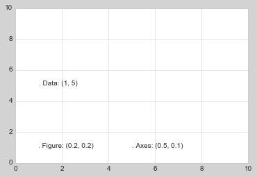
请注意,默认情况下,文本在指定坐标的上方和左侧对齐:这里,在每个字符串的开头的'.'将近似标记给定的坐标位置。
transData坐标给出了关联x轴和y轴标签的常用数据坐标。transAxes坐标给出了相对于轴域左下角(这里是白框)的位置,作为轴域大小的比例。transFigure坐标是相似的,但是指定相对于图左下角(这里是灰框)的位置,作为图形大小的比例。
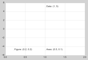
现在请注意,如果我们更改轴限制,那么只有transData坐标会受到影响,而其他坐标则保持不变:
ax.set_xlim(0, 2)
ax.set_ylim(-6, 6)
fig
通过交互式更改轴限制可以更清楚地看到这种行为:如果你在笔记本中执行此代码,你可以通过将%matplotlib inline更改为%matplotlib notebook,并使用每个绘图的菜单与它互动来实现它。
箭头和标注
除了刻度线和文本,另一个有用的标注或标记是简单的箭头。
在 Matplotlib 中绘制箭头通常比砍价要困难得多。虽然plt.arrow()函数是可用的,我不建议使用它:它创建的箭头是 SVG 对象,它们会受到不同长宽比的影响,结果很少是用户所期望的。相反,我建议使用plt.annotate()函数。此函数可创建一些文本和箭头,并且箭头可以非常灵活地指定。
在这里,我们将使用annotate及其几个选项:
%matplotlib inline

fig, ax = plt.subplots()

x = np.linspace(0, 20, 1000)
ax.plot(x, np.cos(x))
ax.axis('equal')

ax.annotate('local maximum', xy=(6.28, 1), xytext=(10, 4),
            arrowprops=dict(facecolor='black', shrink=0.05))

ax.annotate('local minimum', xy=(5 * np.pi, -1), xytext=(2, -6),
            arrowprops=dict(arrowstyle="->",
                            connectionstyle="angle3,angleA=0,angleB=-90"));
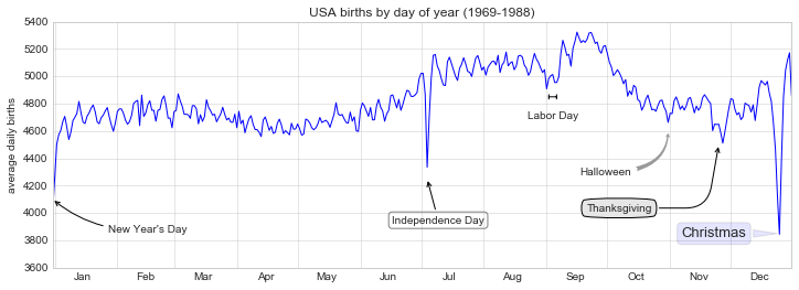
箭头样式通过arrowprops字典控制,该字典有许多选项。这些选项在 Matplotlib 的在线文档中有相当详细的记录,因此,比起在此复述这些选项,快速展示一些选项可能更有用。让我们使用之前的出生率图表演示几种可用选项:
fig, ax = plt.subplots(figsize=(12, 4))
births_by_date.plot(ax=ax)

# 向绘图添加标签
ax.annotate("New Year's Day", xy=('2012-1-1', 4100),  xycoords='data',
            xytext=(50, -30), textcoords='offset points',
            arrowprops=dict(arrowstyle="->",
                            connectionstyle="arc3,rad=-0.2"))

ax.annotate("Independence Day", xy=('2012-7-4', 4250),  xycoords='data',
            bbox=dict(boxstyle="round", fc="none", ec="gray"),
            xytext=(10, -40), textcoords='offset points', ha='center',
            arrowprops=dict(arrowstyle="->"))

ax.annotate('Labor Day', xy=('2012-9-4', 4850), xycoords='data', ha='center',
            xytext=(0, -20), textcoords='offset points')
ax.annotate('', xy=('2012-9-1', 4850), xytext=('2012-9-7', 4850),
            xycoords='data', textcoords='data',
            arrowprops={'arrowstyle': '|-|,widthA=0.2,widthB=0.2', })

ax.annotate('Halloween', xy=('2012-10-31', 4600),  xycoords='data',
            xytext=(-80, -40), textcoords='offset points',
            arrowprops=dict(arrowstyle="fancy",
                            fc="0.6", ec="none",
                            connectionstyle="angle3,angleA=0,angleB=-90"))

ax.annotate('Thanksgiving', xy=('2012-11-25', 4500),  xycoords='data',
            xytext=(-120, -60), textcoords='offset points',
            bbox=dict(boxstyle="round4,pad=.5", fc="0.9"),
            arrowprops=dict(arrowstyle="->",
                            connectionstyle="angle,angleA=0,angleB=80,rad=20"))


ax.annotate('Christmas', xy=('2012-12-25', 3850),  xycoords='data',
             xytext=(-30, 0), textcoords='offset points',
             size=13, ha='right', va="center",
             bbox=dict(boxstyle="round", alpha=0.1),
             arrowprops=dict(arrowstyle="wedge,tail_width=0.5", alpha=0.1));

# 标记轴域
ax.set(title='USA births by day of year (1969-1988)',
       ylabel='average daily births')

# 使用中心化的月标签将 x 轴格式化
ax.xaxis.set_major_locator(mpl.dates.MonthLocator())
ax.xaxis.set_minor_locator(mpl.dates.MonthLocator(bymonthday=15))
ax.xaxis.set_major_formatter(plt.NullFormatter())
ax.xaxis.set_minor_formatter(mpl.dates.DateFormatter('%h'));

ax.set_ylim(3600, 5400);

你会注意到箭头和文本框的规格非常详细:这使你能够创建几乎任何箭头样式。不幸的是,这也意味着这些功能通常必须手动调整,这个过程在制作出版品质的图形时非常耗时!最后我要提醒你,前面的样式混合绝不是展示数据的最佳实践,而是作为一些可用选项的演示。
可用箭头和注释样式的更多讨论和示例,可以在 Matplotlib 库中找到,特别是标注的演示。