8.8 直方图,分箱和密度
原文:Histograms, Binnings, and Density
译者:飞龙
本节是《Python 数据科学手册》(Python Data Science Handbook)的摘录。
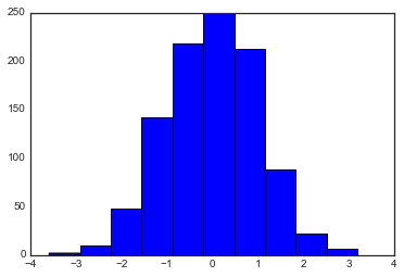
简单的直方图可能是理解数据集的第一步。之前,我们预览了 Matplotlib 直方图函数(参见“比较,掩码和布尔逻辑”),一旦执行了常规的导入,它在一行中创建一个基本直方图:
%matplotlib inline
import numpy as np
import matplotlib.pyplot as plt
plt.style.use('seaborn-white')

data = np.random.randn(1000)

plt.hist(data);
hist()函数有很多调整计算和显示的选项;这是一个更加自定义的直方图的例子:
plt.hist(data, bins=30, normed=True, alpha=0.5,
         histtype='stepfilled', color='steelblue',
         edgecolor='none');

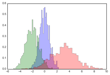
plt.hist的文档字符串提供了其他可用自定义选项的更多信息。我发现histtype='stepfilled'和一些透明度alpha的组合,在比较几种分布的直方图时非常有用:
x1 = np.random.normal(0, 0.8, 1000)
x2 = np.random.normal(-2, 1, 1000)
x3 = np.random.normal(3, 2, 1000)

kwargs = dict(histtype='stepfilled', alpha=0.3, normed=True, bins=40)

plt.hist(x1, **kwargs)
plt.hist(x2, **kwargs)
plt.hist(x3, **kwargs);
如果你想简单地计算直方图(也就是说,计算给定桶中的点数)而不显示它,那么np.histogram()函数是可用的:
counts, bin_edges = np.histogram(data, bins=5)
print(counts)

# [ 12 190 468 301  29]
二维直方图和分箱
就像我们通过将数字放入桶中,创建一维直方图一样,我们也可以通过将点放入通过二维的桶中,来创建二维直方图。我们将在这里简要介绍几种方法。我们首先定义一些数据 - 从多元高斯分布中抽取的x和y数组:
mean = [0, 0]
cov = [[1, 1], [1, 2]]
x, y = np.random.multivariate_normal(mean, cov, 10000).T
plt.hist2d:二维直方图
绘制二维直方图的一种简单方法是使用 Matplotlib 的plt.hist2d函数:
plt.hist2d(x, y, bins=30, cmap='Blues')
cb = plt.colorbar()
cb.set_label('counts in bin')
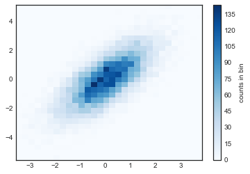
就像plt.hist一样,plt.hist2d有许多微调绘图和分箱的额外选项来,这在函数的文档字符串中有很好的概述。此外,正如plt.hist在np.histogram中存在对应,plt.hist2d在np.histogram2d中也存在对应,可以按如下方式使用:
counts, xedges, yedges = np.histogram2d(x, y, bins=30)
对于维度大于 2 的直方图分箱的推广,请参阅np.histogramdd函数。
plt.hexbin:六边形分箱
二维直方图创建了横跨坐标轴的正方形细分。这种细分的另一种自然形状是正六边形。为此,Matplotlib 提供了plt.hexbin例程,它将表示在六边形网格中分箱的二维数据集:
plt.hexbin(x, y, gridsize=30, cmap='Blues')
cb = plt.colorbar(label='count in bin')

plt.hexbin有许多有趣的选项,包括为每个点指定权重,以及将每个桶中的输出更改为任何 NumPy 聚合(权重的平均值,权重的标准差等)。
核密度估计
另一种评估多维密度的常用方法是核密度估计(KDE)。这将在“深度:核密度估计”中全面讨论,但是现在我们只是提到,KDE 可以被认为是“消去”空间中的点,并将结果相加来获得平滑函数的一种方式。
scipy.stats包中存在非常快速和简单的 KDE 实现。以下是在此数据上使用 KDE 的快速示例:
from scipy.stats import gaussian_kde

# 拟合大小为 [Ndim, Nsamples] 的数组
data = np.vstack([x, y])
kde = gaussian_kde(data)

# 在常规网格上评估
xgrid = np.linspace(-3.5, 3.5, 40)
ygrid = np.linspace(-6, 6, 40)
Xgrid, Ygrid = np.meshgrid(xgrid, ygrid)
Z = kde.evaluate(np.vstack([Xgrid.ravel(), Ygrid.ravel()]))

# 将结果绘制为图像
plt.imshow(Z.reshape(Xgrid.shape),
           origin='lower', aspect='auto',
           extent=[-3.5, 3.5, -6, 6],
           cmap='Blues')
cb = plt.colorbar()
cb.set_label("density")
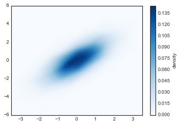
KDE 具有平滑长度,可以在细节和平滑度之间有效地调整(无处不在的偏差 - 方差权衡的一个例子)。有关选择合适的平滑长度的文献非常多:gaussian_kde使用经验法则,试图为输入数据找到近似最佳的平滑长度。
SciPy 生态系统中提供了其他 KDE 实现,每个实现都有自己的优点和缺点;例如,参见sklearn.neighbors.KernelDensity和statsmodels.nonparametric.kernel_density.KDEMultivariate。对于基于 KDE 的可视化,使用 Matplotlib 往往过于冗长。在“可视化和 Seaborn”中讨论的 Seaborn 库,提供了更为简洁的 API 来创建基于 KDE 的可视化。