Highcharts 对数图表
以下实例演示了对数图表。
我们在前面的章节已经了解了 Highcharts 配置语法。接下来让我们来看下如何配置。
配置
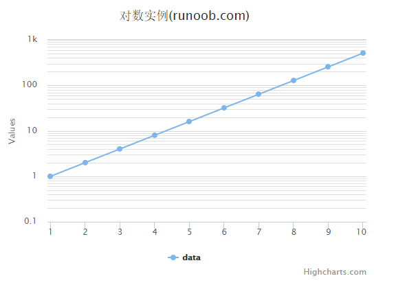
配置 yAxis.type 为 'logarithmic'。它定义了 x 轴类型。可选值有 "linear", "logarithmic", "datetime" 或 "category"。默认值为linear。
yAxis var yAxis = { type: 'logarithmic', minorTickInterval: 0.1 };
实例
文件名:highcharts_line_logarithmic.htm
<html> <head> <title>Highcharts 教程 | 菜鸟教程(runoob.com)</title> <script src="http://apps.bdimg.com/libs/jquery/2.1.4/jquery.min.js"></script> <script src="/try/demo_source/highcharts.js"></script> </head> <body> <div id="container" style="width: 550px; height: 400px; margin: 0 auto"></div> <script language="JavaScript"> $(document).ready(function() { var title = { text: '对数实例(runoob.com)' }; var xAxis = { tickInterval: 1 }; var yAxis = { type: 'logarithmic', minorTickInterval: 0.1 }; var tooltip = { headerFormat: '<b>{series.name}</b><br>', pointFormat: 'x = {point.x}, y = {point.y}' }; var plotOptions = { spline: { marker: { enabled: true } } }; var series= [{ name: 'data', data: [1, 2, 4, 8, 16, 32, 64, 128, 256, 512], pointStart: 1 } ]; var json = {}; json.title = title; json.tooltip = tooltip; json.xAxis = xAxis; json.yAxis = yAxis; json.series = series; json.plotOptions = plotOptions; $('#container').highcharts(json); }); </script> </body> </html>
以上实例输出结果为: