Highcharts 柱形图,线条图,饼图组合
以下实例演示了柱形图,线条图,饼图的组合。
我们在前面的章节已经了解了 Highcharts 基本配置语法。接下来让我们来看下其他的配置。
配置
series 配置
设置 series 的 type 属性为 column/line/pie ,series.type 描述了数据列类型。默认值为 "line"。
var series = { type: 'column' };
实例
文件名:highcharts_combinations_column.htm
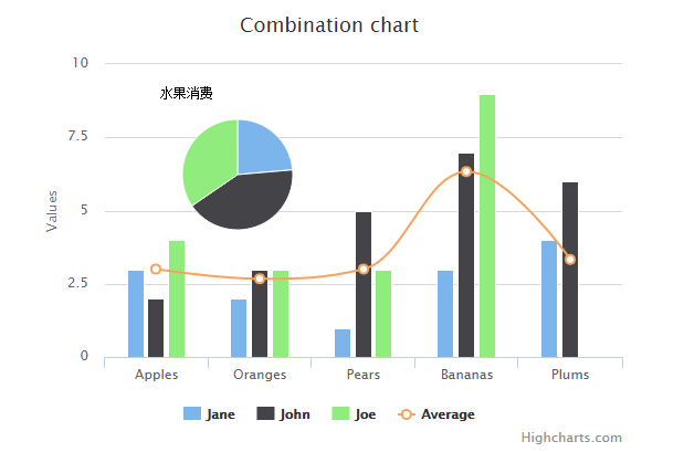
<html> <head> <title>Highcharts 教程 | 菜鸟教程(runoob.com)</title> <script src="http://apps.bdimg.com/libs/jquery/2.1.4/jquery.min.js"></script> <script src="/try/demo_source/highcharts.js"></script> </head> <body> <div id="container" style="width: 550px; height: 400px; margin: 0 auto"></div> <script language="JavaScript"> $(document).ready(function() { var title = { text: 'Combination chart' }; var xAxis = { categories: ['Apples', 'Oranges', 'Pears', 'Bananas', 'Plums'] }; var labels = { items: [{ html: '水果消费', style: { left: '50px', top: '18px', color: (Highcharts.theme && Highcharts.theme.textColor) || 'black' } }] }; var series= [{ type: 'column', name: 'Jane', data: [3, 2, 1, 3, 4] }, { type: 'column', name: 'John', data: [2, 3, 5, 7, 6] }, { type: 'column', name: 'Joe', data: [4, 3, 3, 9, 0] }, { type: 'spline', name: 'Average', data: [3, 2.67, 3, 6.33, 3.33], marker: { lineWidth: 2, lineColor: Highcharts.getOptions().colors[3], fillColor: 'white' } }, { type: 'pie', name: '总消费', data: [{ name: 'Jane', y: 13, color: Highcharts.getOptions().colors[0] // Jane 的颜色 }, { name: 'John', y: 23, color: Highcharts.getOptions().colors[1] // John 的颜色 }, { name: 'Joe', y: 19, color: Highcharts.getOptions().colors[2] // Joe 的颜色 }], center: [100, 80], size: 100, showInLegend: false, dataLabels: { enabled: false } } ]; var json = {}; json.title = title; json.xAxis = xAxis; json.labels = labels; json.series = series; $('#container').highcharts(json); }); </script> </body> </html>
以上实例输出结果为: