Highcharts 多Y轴组合
以下实例演示了多Y轴的组合。
我们在前面的章节已经了解了 Highcharts 基本配置语法。接下来让我们来看下其他的配置。
配置
yAxis 配置
在 yAxis 属性中添加多条Y轴的值 。
var yAxis = [{ // 第一条Y轴 }, { // 第二条Y轴 },{ // 第三题Y轴 } }]
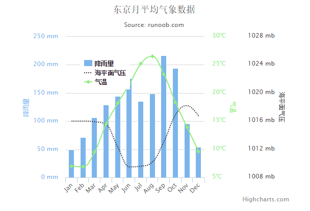
实例
文件名:highcharts_combinations_axes.htm
<html> <head> <title>Highcharts 教程 | 菜鸟教程(runoob.com)</title> <script src="http://apps.bdimg.com/libs/jquery/2.1.4/jquery.min.js"></script> <script src="/try/demo_source/highcharts.js"></script> </head> <body> <div id="container" style="width: 550px; height: 400px; margin: 0 auto"></div> <script language="JavaScript"> $(document).ready(function() { var chart = { zoomType: 'xy' }; var subtitle = { text: 'Source: runoob.com' }; var title = { text: '东京月平均气象数据' }; var xAxis = { categories: ['Jan', 'Feb', 'Mar', 'Apr', 'May', 'Jun','Jul', 'Aug', 'Sep', 'Oct', 'Nov', 'Dec'], crosshair: true }; var yAxis= [{ // 第一条Y轴 labels: { format: '{value}\xB0C', style: { color: Highcharts.getOptions().colors[2] } }, title: { text: '气温', style: { color: Highcharts.getOptions().colors[2] } }, opposite: true }, { // 第二条Y轴 title: { text: '降雨量', style: { color: Highcharts.getOptions().colors[0] } }, labels: { format: '{value} mm', style: { color: Highcharts.getOptions().colors[0] } } }, { // 第三条Y轴 gridLineWidth: 0, title: { text: '海平面气压', style: { color: Highcharts.getOptions().colors[1] } }, labels: { format: '{value} mb', style: { color: Highcharts.getOptions().colors[1] } }, opposite:true }]; var tooltip = { shared: true }; var legend = { layout: 'vertical', align: 'left', x: 120, verticalAlign: 'top', y: 100, floating: true, backgroundColor: (Highcharts.theme && Highcharts.theme.legendBackgroundColor) || '#FFFFFF' }; var series= [{ name: '降雨量', type: 'column', yAxis: 1, data: [49.9, 71.5, 106.4, 129.2, 144.0, 176.0, 135.6, 148.5, 216.4, 194.1, 95.6, 54.4], tooltip: { valueSuffix: ' mm' } },{ name: '海平面气压', type: 'spline', yAxis: 2, data: [1016, 1016, 1015.9, 1015.5, 1012.3, 1009.5, 1009.6, 1010.2, 1013.1, 1016.9, 1018.2, 1016.7], marker: { enabled: false }, dashStyle: 'shortdot', tooltip: { valueSuffix: ' mb' } },{ name: '气温', type: 'spline', data: [7.0, 6.9, 9.5, 14.5, 18.2, 21.5, 25.2, 26.5, 23.3, 18.3, 13.9, 9.6], tooltip: { valueSuffix: '\xB0C' } } ]; var json = {}; json.chart = chart; json.title = title; json.subtitle = subtitle; json.xAxis = xAxis; json.yAxis = yAxis; json.tooltip = tooltip; json.legend = legend; json.series = series; $('#container').highcharts(json); }); </script> </body> </html>
以上实例输出结果为: