Highcharts 堆叠3D柱形图
以下实例演示了堆叠3D柱形图。
我们在前面的章节已经了解了 Highcharts 基本配置语法。接下来让我们来看下其他的配置。
配置
chart.options3d 配置
以下列出了 3D 图的基本配置,设置 chart 的 type 属性为 column,options3d 选项可设置三维效果。
var chart = { type: 'column', options3d: { enabled: true, //显示图表是否设置为3D, 我们将其设置为 true alpha: 15, //图表视图旋转角度 beta: 15, //图表视图旋转角度 depth: 50, //图表的合计深度,默认为100 viewDistance: 25 //定义图表的浏览长度 } };
实例
文件名:highcharts_3d_stacking.htm
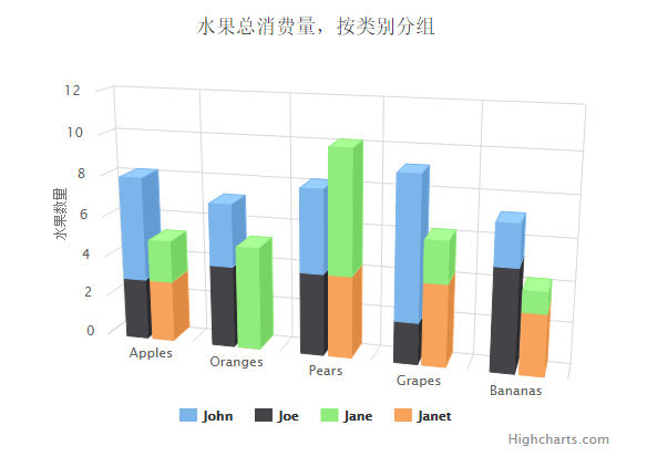
<html> <head> <title>Highcharts 教程 | 菜鸟教程(runoob.com)</title> <script src="http://apps.bdimg.com/libs/jquery/2.1.4/jquery.min.js"></script> <script src="/try/demo_source/highcharts.js"></script> <script src="/try/demo_source/highcharts-3d.js"></script> </head> <body> <div id="container" style="width: 550px; height: 400px; margin: 0 auto"></div> <script language="JavaScript"> $(document).ready(function() { var chart = { type: 'column', marginTop: 80, marginRight: 40, options3d: { enabled: true, alpha: 15, beta: 15, viewDistance: 25, depth: 40 } }; var title = { text: '水果总消费量,按类别分组' }; var xAxis = { categories: ['Apples', 'Oranges', 'Pears', 'Grapes', 'Bananas'] }; var yAxis = { allowDecimals: false, min: 0, title: { text: '水果数量' } }; var tooltip = { headerFormat: '<b>{point.key}</b><br>', pointFormat: '<span style="color:{series.color}">\u25CF</span> {series.name}: {point.y} / {point.stackTotal}' }; var plotOptions = { column: { stacking: 'normal', depth: 40 } }; var series= [{ name: 'John', data: [5, 3, 4, 7, 2], stack: 'male' }, { name: 'Joe', data: [3, 4, 4, 2, 5], stack: 'male' }, { name: 'Jane', data: [2, 5, 6, 2, 1], stack: 'female' }, { name: 'Janet', data: [3, 0, 4, 4, 3], stack: 'female' }]; var json = {}; json.chart = chart; json.title = title; json.xAxis = xAxis; json.yAxis = yAxis; json.tooltip = tooltip; json.plotOptions = plotOptions; json.series = series; $('#container').highcharts(json); }); </script> </body> </html>
以上实例输出结果为: