Highcharts 显示图例饼图
以下实例演示了显示图例饼图。
我们在前面的章节已经了解了 Highcharts 基本配置语法。接下来让我们来看下其他的配置。
配置
series 配置
设置 series 的 type 属性为 pie ,series.type 描述了数据列类型。默认值为 "line"。
var series = { type: 'pie' };
plotOptions
plotOptions 使用 plotOptions.pie.showInLegend 属性来设置是否显示图例。
var plotOptions = { pie: { allowPointSelect: true, cursor: 'pointer', dataLabels: { enabled: false }, showInLegend: true } };
实例
文件名:highcharts_pie_legends.htm
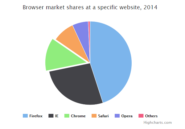
<html> <head> <title>Highcharts 教程 | 菜鸟教程(runoob.com)</title> <script src="http://apps.bdimg.com/libs/jquery/2.1.4/jquery.min.js"></script> <script src="/try/demo_source/highcharts.js"></script> </head> <body> <div id="container" style="width: 550px; height: 400px; margin: 0 auto"></div> <script language="JavaScript"> $(document).ready(function() { var chart = { plotBackgroundColor: null, plotBorderWidth: null, plotShadow: false }; var title = { text: 'Browser market shares at a specific website, 2014' }; var tooltip = { pointFormat: '{series.name}: <b>{point.percentage:.1f}%</b>' }; var plotOptions = { pie: { allowPointSelect: true, cursor: 'pointer', dataLabels: { enabled: false }, showInLegend: true } }; var series= [{ type: 'pie', name: 'Browser share', data: [ ['Firefox', 45.0], ['IE', 26.8], { name: 'Chrome', y: 12.8, sliced: true, selected: true }, ['Safari', 8.5], ['Opera', 6.2], ['Others', 0.7] ] }]; var json = {}; json.chart = chart; json.title = title; json.tooltip = tooltip; json.series = series; json.plotOptions = plotOptions; $('#container').highcharts(json); }); </script> </body> </html>
以上实例输出结果为: