Highcharts 丢失值区域图
以下实例演示了丢失值区域图。
我们在前面的章节已经了解了 Highcharts 基本配置语法。接下来让我们来看下其他的配置。在 chart 中添加 spacingBottom 属性。
chart 配置
将 chart 的 spacingBottom 属性设置为 30。表示图表间的间隔区间。
var chart = { type: 'area', spacingBottom: 30 };
实例
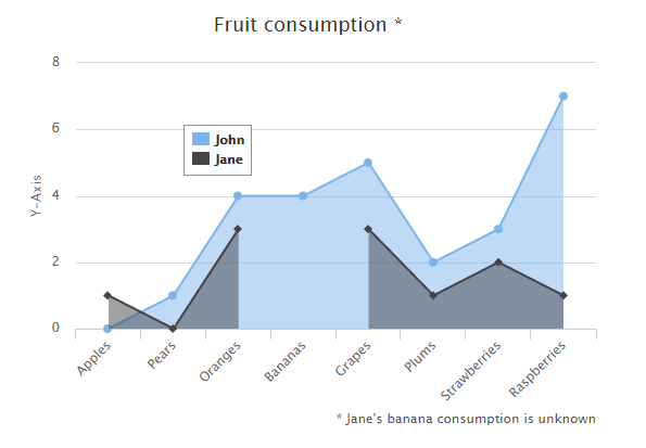
文件名:highcharts_area_missing.htm
<html> <head> <title>Highcharts 教程 | 菜鸟教程(runoob.com)</title> <script src="http://apps.bdimg.com/libs/jquery/2.1.4/jquery.min.js"></script> <script src="/try/demo_source/highcharts.js"></script> </head> <body> <div id="container" style="width: 550px; height: 400px; margin: 0 auto"></div> <script language="JavaScript"> $(document).ready(function() { var chart = { type: 'area', spacingBottom: 30 }; var title = { text: 'Fruit consumption *' }; var subtitle = { text: '* Jane\'s banana consumption is unknown', floating: true, align: 'right', verticalAlign: 'bottom', y: 15 }; var legend = { layout: 'vertical', align: 'left', verticalAlign: 'top', x: 150, y: 100, floating: true, borderWidth: 1, backgroundColor: (Highcharts.theme && Highcharts.theme.legendBackgroundColor) || '#FFFFFF' }; var xAxis = { categories: ['Apples', 'Pears', 'Oranges', 'Bananas', 'Grapes', 'Plums', 'Strawberries', 'Raspberries'] }; var yAxis = { title: { text: 'Y-Axis' }, labels: { formatter: function () { return this.value; } } }; var tooltip = { formatter: function () { return '<b>' + this.series.name + '</b><br/>' + this.x + ': ' + this.y; } }; var plotOptions = { area: { fillOpacity: 0.5 } }; var credits = { enabled: false }; var series= [{ name: 'John', data: [0, 1, 4, 4, 5, 2, 3, 7] }, { name: 'Jane', data: [1, 0, 3, null, 3, 1, 2, 1] } ]; var json = {}; json.chart = chart; json.title = title; json.subtitle = subtitle; json.xAxis = xAxis; json.yAxis = yAxis; json.legend = legend; json.tooltip = tooltip; json.plotOptions = plotOptions; json.credits = credits; json.series = series; $('#container').highcharts(json); }); </script> </body> </html>
以上实例输出结果为: