量化分析师的Python日记【第8天 Q Quant兵器谱之函数插值】
来源:https://uqer.io/community/share/551cfa1ff9f06c8f339044ff
在本篇中,我们将介绍Q宽客常用工具之一:函数插值。接着将函数插值应用于一个实际的金融建模场景中:波动率曲面构造。
通过本篇的学习您将学习到:
- 如何在
scipy中使用函数插值模块:interpolate;- 波动率曲面构造的原理;
- 将
interpolate运用于波动率曲面构造。
1. 如何使用scipy做函数插值
函数插值,即在离散数据的基础上补插连续函数,估算出函数在其他点处的近似值的方法。在scipy中,所有的与函数插值相关的功能都在scipy.interpolate模块中
from scipy import interpolate
dir(interpolate)[:5]

['Akima1DInterpolator',
 'BPoly',
 'BarycentricInterpolator',
 'BivariateSpline',
 'CloughTocher2DInterpolator']
作为介绍性质的本篇,我们将只关注interpolate.spline的使用,即样条插值方法:
xk离散的自变量值,为序列yk对应xk的函数值,为与xk长度相同的序列xnew需要进行插值的自变量值序列order样条插值使用的函数基德阶数,为1时使用线性函数
print interpolate.spline.__doc__

Interpolate a curve at new points using a spline fit

Parameters
----------
xk, yk : array_like
    The x and y values that define the curve.
xnew : array_like
    The x values where spline should estimate the y values.
order : int
    Default is 3.
kind : string
    One of {'smoothest'}
conds : Don't know
    Don't know

Returns
-------
spline : ndarray
    An array of y values; the spline evaluated at the positions `xnew`.
1.1 三角函数(np.sin)插值
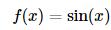
一例胜千言!让我们这里用实际的一个示例,来说明如何在scipy中使用函数插值。这里的目标函数是三角函数:
假设我们已经观测到的f(x)在离散点x=(1,3,5,7,9,11,13)的值:
import numpy as np
from matplotlib import pylab
import seaborn as sns
font.set_size(20)
x = np.linspace(1.0, 13.0, 7)
y = np.sin(x)
pylab.figure(figsize = (12,6))
pylab.scatter(x,y, s = 85, marker='x', color = 'r')
pylab.title(u'$f(x)$离散点分布', fontproperties = font)

<matplotlib.text.Text at 0x142cafd0>

首先我们使用最简单的线性插值算法,这里面只要将spline的参数order设置为1即可:
xnew = np.linspace(1.0,13.0,500)
ynewLinear = interpolate.spline(x,y,xnew,order = 1)
ynewLinear[:5]

array([ 0.84147098,  0.83304993,  0.82462888,  0.81620782,  0.80778677])
复杂一些的,也是spline函数默认的方法,即为样条插值,将order设置为3即可:
最后我们获得真实的sin(x)的值:
ynewReal = np.sin(xnew)
ynewReal[:5]

array([ 0.84147098,  0.85421967,  0.86647437,  0.87822801,  0.88947378])
让我们把所有的函数画到一起,看一下插值的效果。对于我们这个例子中的目标函数而言,由于本身目标函数是光滑函数,则越高阶的样条插值的方法,插值效果越好。
pylab.figure(figsize = (16,8))
pylab.plot(xnew,ynewReal)
pylab.plot(xnew,ynewLinear)
pylab.plot(xnew,ynewCubicSpline)
pylab.scatter(x,y, s = 160, marker='x', color = 'k')
pylab.legend([u'真实曲线', u'线性插值', u'样条插值', u'$f(x)$离散点'], prop = font)
pylab.title(u'$f(x)$不同插值方法拟合效果:线性插值 v.s 样条插值', fontproperties = font)

<matplotlib.text.Text at 0x1424cd50>

2. 函数插值应用 —— 期权波动率曲面构造
市场上期权价格一般以隐含波动率的形式报出,一般来讲在市场交易时间,交易员可以看到类似的波动率矩阵(Volatilitie Matrix):
import pandas as pd
pd.options.display.float_format = '{:,>.2f}'.format
dates = [Date(2015,3,25), Date(2015,4,25), Date(2015,6,25), Date(2015,9,25)]
strikes = [2.2, 2.3, 2.4, 2.5, 2.6]
blackVolMatrix = np.array([[ 0.32562851,  0.29746885,  0.29260648,  0.27679993],
                  [ 0.28841840,  0.29196629,  0.27385023,  0.26511898],
                  [ 0.27659511,  0.27350773,  0.25887604,  0.25283775],
                  [ 0.26969754,  0.25565971,  0.25803327,  0.25407669],
                  [ 0.27773032,  0.24823248,  0.27340796,  0.24814975]])
table = pd.DataFrame(blackVolMatrix * 100, index = strikes, columns = dates, )
table.index.name = u'行权价'
table.columns.name = u'到期时间'
print u'2015年3月3日10时波动率矩阵'
table

2015年3月3日10时波动率矩阵
| 到期时间 | March 25th, 2015 | April 25th, 2015 | June 25th, 2015 | September 25th, 2015 |
|---|---|---|---|---|
| 行权价 | ||||
| 2.20 | 32.56 | 29.75 | 29.26 | 27.68 |
| 2.30 | 28.84 | 29.20 | 27.39 | 26.51 |
| 2.40 | 27.66 | 27.35 | 25.89 | 25.28 |
| 2.50 | 26.97 | 25.57 | 25.80 | 25.41 |
| 2.60 | 27.77 | 24.82 | 27.34 | 24.81 |
交易员可以看到市场上离散值的信息,但是如果可以获得一些隐含的信息更好:例如,在2015年6月25日以及2015年9月25日之间,波动率的形状会是怎么样的?
2.1 方差曲面插值
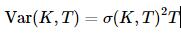
我们并不是直接在波动率上进行插值,而是在方差矩阵上面进行插值。方差和波动率的关系如下:
所以下面我们将通过处理,获取方差矩阵(Variance Matrix):
evaluationDate = Date(2015,3,3)
ttm = np.array([(d - evaluationDate) / 365.0 for d in dates])
varianceMatrix = (blackVolMatrix**2) * ttm
varianceMatrix

array([[ 0.00639109,  0.0128489 ,  0.02674114,  0.04324205],
       [ 0.0050139 ,  0.01237794,  0.02342277,  0.03966943],
       [ 0.00461125,  0.01086231,  0.02093128,  0.03607931],
       [ 0.00438413,  0.0094909 ,  0.02079521,  0.03643376],
       [ 0.00464918,  0.00894747,  0.02334717,  0.03475378]])
这里的值varianceMatrix就是变换而得的方差矩阵。
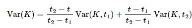
下面我们将在行权价方向以及时间方向同时进行线性插值,具体地,行权价方向:
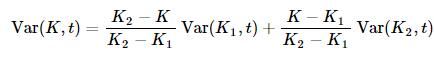
时间方向:
这个过程在scipy中可以直接通过interpolate模块下interp2d来实现:
ttm时间方向离散点strikes行权价方向离散点varianceMatrix方差矩阵,列对应时间维度;行对应行权价维度kind = 'linear'指示插值以线性方式进行
interp = interpolate.interp2d(ttm, strikes, varianceMatrix, kind = 'linear')
返回的interp对象可以用于获取任意点上插值获取的方差值:
interp(ttm[0], strikes[0])

array([ 0.00639109])
最后我们获取整个平面上所有点的方差值,再转换为波动率曲面。
sMeshes = np.linspace(strikes[0], strikes[-1], 400)
tMeshes = np.linspace(ttm[0], ttm[-1], 200)
interpolatedVarianceSurface = np.zeros((len(sMeshes), len(tMeshes)))
for i, s in enumerate(sMeshes):
    for j, t in enumerate(tMeshes):
        interpolatedVarianceSurface[i][j] = interp(t,s)

interpolatedVolatilitySurface = np.sqrt((interpolatedVarianceSurface / tMeshes))
print u'行权价方向网格数:', np.size(interpolatedVolatilitySurface, 0)
print u'到期时间方向网格数:', np.size(interpolatedVolatilitySurface, 1)

行权价方向网格数: 400
到期时间方向网格数: 200
选取某一个到期时间上的波动率点,看一下插值的效果。这里我们选择到期时间最近的点:2015年3月25日:
pylab.figure(figsize = (16,8))
pylab.plot(sMeshes, interpolatedVolatilitySurface[:, 0])
pylab.scatter(x = strikes, y = blackVolMatrix[:,0], s = 160,marker = 'x', color = 'r')
pylab.legend([u'波动率(线性插值)', u'波动率(离散)'], prop = font)
pylab.title(u'到期时间为2015年3月25日期权波动率', fontproperties = font)

<matplotlib.text.Text at 0xea27f90>

最终,我们把整个曲面的图像画出来看看:
from mpl_toolkits.mplot3d import Axes3D
from matplotlib import cm

maturityMesher, strikeMesher = np.meshgrid(tMeshes, sMeshes)
pylab.figure(figsize = (16,9))
ax = pylab.gca(projection = '3d')
surface = ax.plot_surface(strikeMesher, maturityMesher, interpolatedVolatilitySurface*100, cmap = cm.jet)
pylab.colorbar(surface,shrink=0.75)
pylab.title(u'2015年3月3日10时波动率曲面', fontproperties = font)
pylab.xlabel("strike")
pylab.ylabel("maturity")
ax.set_zlabel(r"volatility(%)")

<matplotlib.text.Text at 0x14e03050>
